On one of my favorite websites I found photographer Natascha Libbert. The first photo I saw of the man with the airline girls automatically made me wonder what this photographer was about and their story behind he photographs. I read through her biography/interview only to find a more intriguing/beautiful picture. I'm hoping to use this photo for one of my radial posters but I'm not having much luck with it as of now.
Saturday, February 27, 2010
Wednesday, February 24, 2010
Final Axial Posters - Process 2
For this week's type process post I decided to process the music posters that I did. The axial system seemed as though it was going to be the quickest and easiest but soon after starting I found that this was not the case. To start both of my posters I looked around at different design websites and design magazines to see how they handle type and if they were using the axial system. I also wanted to get a feel for what other people were doing with music posters. After sketching out several idea's, I went to work on the computer. Out of habit, I tend to start out my ideas in black and white so that I don't focus too much on color. I immediately found a guitar that I wanted to use and from there I started playing around with the size and placement of it. Once the guitar was set I knew that this was going to become my axis. I made a lock up for the name of the band to fit the shape of the bottom of the guitar. Adding in the other text was a bit of a struggle with trying to keep hierarchy. I wasn't thrilled with how it came out but now it was time to play with color. Since the design was so simple I knew that I wanted to do bright colors. These bright colors ended up carrying into my second poster which I wanted to focus more on the type and less with a graphic element. I created a sort of design element at the top using the ACL Music Festival and then stacked type along the right axis at the bottom according to importance. After creating the poster and playing with colors I noticed a large empty space on the right, I went back and added a music note to fill the shape. I chose this certain note due to the shape and curl of it to counteract all the hard square geometric shapes I used with the type. Looking back I wish I saved photos of my posters as I went along so I didn't have so much explaining to do but I definitely learned my lesson for the next project!
Inspiration for project: one of my favorite music posters I found, not necessarily axial but I loved it anyways!
Final Axial Posters - bloggers crappy colors are at it once again
Oops
I haven't updated lately, the spring semester has finalllly started to catch up to me and I need to get ahead! In the past week we've had 2 form projects due. The first one due was making the meaning part 2, we had to select a word from our original set and then find images that represent the meaning. For this I chose Desolate. Below are the cards I ended with, see if you can guess them! I'll put the answers later along part 1 of our new project.
I haven't updated lately, the spring semester has finalllly started to catch up to me and I need to get ahead! In the past week we've had 2 form projects due. The first one due was making the meaning part 2, we had to select a word from our original set and then find images that represent the meaning. For this I chose Desolate. Below are the cards I ended with, see if you can guess them! I'll put the answers later.
Monday, February 22, 2010
Still Eyes
Amazing and gorgeous only 2 words that describe Mike Bailey Gates. HE'S 17! yet his work is like a professional. Click on his name to check out his website and more photography! He is truly inspiring, never too young to become a famous photographer or at least start!
Friday, February 19, 2010
Maclab #1
First day of maclab was a huge fail. Learned flash and hated it as you can tell by movie. Animation is not my thing.
Tuesday, February 16, 2010
Who will catch it?
Drop cap 1 - Process
First drop cap of the semester, DONE! Like many other people I wasn't really sure what was meant by a "drop cap" and had to google and search around to fully understand what it was. I also checked out the original Daily Drop Cap to find some sort of inspiration as to where to start. Even with all the ideas I found I ended up coming up with something completely different. I have the tendencies to draw circles on my papers when I'm bored or zoning out and class and it gave me the idea during philosophy to make my drop cap out of circles! I could have just as easily done this in Illustrator but wanted to do something by hand with pen since I normally shy away from it and use the computer. Using a circle guide I made some sort of pattern in my head and tried to follow it as much as possible. I was pretty happy with the way that it came out. I could see using this letter as part of an architecture company's logo or some sort of business that deals with geometry.
UPDATE: In class today we were told that for next week our new drop cap is just to update and fix the first letter. Rather than completely do my drop cap over by hand I decided to try it in illustrator. People in class suggested varying the width of the lines so I played around with that in illustrator and am not sure how I feel about it. Both versions are below even though they are kind of hard to tell the difference.
Forgotten
L is for...
Wellll we had the first day of VC classes finally and it wasn't too bad. We got our first Form project which consist of choosing a card with a picture and then making 10 5x5 squares with other words that change the meaning between the relationship of the image and the word. Basically 1+1=3 all over again. I ended up with Lion, instead of posting all the other cards too and to save some space the other words I used were:
desolate
detained
constellation
prowl
scripture
sovereign
fable
ringmaster
assailant
I didn't mind this project but at the same time don't know if I did it exactly right. In type we found out that we need to keep a twitter (eh) and a blog with at least 2 blogs a week which isn't too much of an issue since I have this one which luckily I ended up starting in winter session again. Received a new printmaking project to make more stamps today also! Woo projects are starting to build back up.
UPDATE: I had to redo two of the words (fable and prowl) because they were considered to be duplicates to assaliant and scripture. Rather than choosing another word I continued with fable and added on Glinda and Vampire. For the next part of this project we have to pick one of the words and then find pictures to match, for this I am going to use fable.
Friday, February 12, 2010
Stamping
Our first printmaking assignment was to create our own printmaking technique that fits into one of the four categories of printmaking. I decided to use stamping as the technique but put a different spin on it. Using four different size hair brushes as my "stamps" I dipped them in paint and then applied it to a canvas. The different size tips and widths between them left different size dots on the canvas. Below is the outcome, I liked the way it came out I decided that I wanted to do another using cool colors. I'm not sure that my method actually fits into one of the categories but I'm gonna try and use it anyways. (Blogger's colors are a little off and make it look a little darker and brown in some spots than it actually is)
Thursday, February 11, 2010
Spin me right round
Bored again, looking through UO's blog and found this website, love Kropp's mixed media stuff and his tree Polaroids are more of an incentive for me to take my wonderful Polaroid out and take some pictures! Maybe a combination of Polaroid's and line work for a project?
Stop and stare
Monday, February 8, 2010
Tomorrow
I saw this website on urban outfitters blog and love it. I love Paper Jam Press and their handcrafted letter pressed posters. Some saying's don't necessarily make sense but that makes them all the better. Spring classes start tomorrow and it's starting to get nerve wrecking. Thankfully we don't start it out with our VC classes so hopefully no projects will be handed out tomorrow in printmaking. Hopefully the spring semester goes well and I'll be able to get my head on straight finally. Below was found on another favorite website of mine, Friends of Type, I like the line work and the way the words and lines fit together, possible business card?
Friday, February 5, 2010
Waiting for the snow..
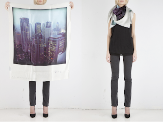
http://reborn.ws/shop/PhilippeRoucou/
someone please buy me one,
great combination - scarves & polaroids ♥
So I went to the library to study for my terrible geography final (winter session is finally done!!) and ended up wandering around looking for an interesting book. I found the fashion section and pulled out a Chanel book. Very inspiring, very interesting, and verryy unique. These are a couple photos from the book that were my favorite. (Chanel ad, hair bows were always in style, camille pattern)
Wednesday, February 3, 2010
THREE.FIVE.
I have literally been dying to see this movie since i first heard about it and am sick of waiting for it!
(no copyright intended)
Tuesday, February 2, 2010
And the rest...
Portraits
Project 3 (Final) Portraiture is not my thing. I feel so awkward instructing people on how to sit or place their hands or which way to look. I always know what I want I just don't feel right on telling them to do it, almost creepy. Project 3 was all about portraits, facial expressions, body parts, and narrative. I was relaxed about the project and knew what I was going for. We needed 4 final prints, 2 straight and 2 bent. The goal was to produce 4 photos that could have been taken by 4 different photographers. I don't know if I exactly accomplished this but I was happy with what I came up with. "Bent" means that we needed to use a different process of manipulation to the photo after we had printed it. This part I saved till last and was overwhelmed by.
Update: So I got to class and realized that some pictures weren't working and had to completely rethink my finals. I ended up not using either of the above as my "straight" finals but did use one to make my multiple exposure "bent" photo. I think they came out alright, certain parts I would have been happier with but time crunches are not my thing. (Sorry for the crappy photo quality, dorm rooms + artwork documentation = not necessarily the best)
Lights and Shadows
Project number twoo.. the class started to pick up with this project but it was still all stuff we did with our digital camera in freshman year. For this we needed to turn in three final photos and shoot at least 3 rolls of film (FILM = EXPENSIVE). One photo needed to be light through a window, a photo in which natural light is reflecting shadows, and the third photo could be taken using artificial light or light at night. I wasn't really impressed and kind of disappointed in the photos I took but for some reason didn't have the desire to make them any better, probably the cold.. again. I know its not a good reason especially for an art major but hey I got an A.
Subscribe to:
Posts (Atom)